A new look for Mostly Harmless Ideas
Help me select a new icon for the Substack
Hey, I recently moved this publication to a custom domain, blog.apiad.net, and to celebrate that, I want to try a slight change of colors.
I was hoping you could help me decide the best new looks.
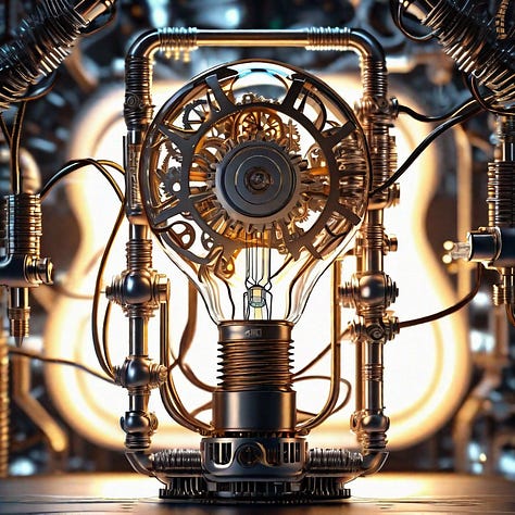
I’ve rendered several variants of “mechanical device with a lightbulb and lots of gears and cables,” which is the semi-abstract illustration I’ve used for a while.
Here are the options I’m currently considering:


These are all the same prompt, varying in style, starting at the top row, left to right; we have fantasy art, then anime, and futuristic. The bottom row is digital art, standard, and enhanced.
Vote for either one of the top or bottom rows (or one of each if you prefer). I’ll wait for a week before deciding.
If you have any additional feedback or suggestions, leave me a comment.
Thanks for your feedback!


I'm now painfully aware that images are shown in vertical on the phone. Should have checked the preview before publishing 🤣